Ad-to-Landing Page Mismatch: The Silent Conversion Killer
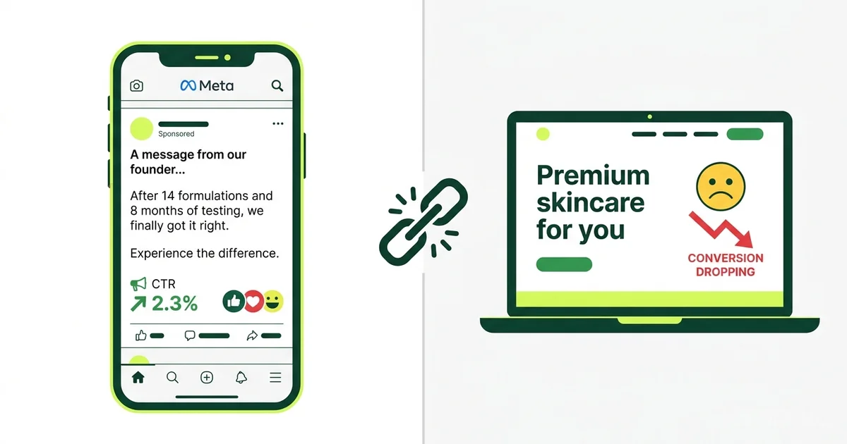
A D2C brand runs a Meta ad with a specific hook: “14 formulations. 8 months. My dermatologist thought I was insane.” The ad gets strong hold rates. People click. CTR is above 2%.
The click lands on a product page that says “Premium skincare for modern women.”
Everything the ad built disappears. The specificity that earned attention is gone. The emotional context that made someone stop scrolling is replaced by generic brand language. The visitor has to start over, figuring out why they should care. Most of them don’t.
This is the ad-to-landing page mismatch, and it is the single most common reason D2C brands have strong ad metrics and weak revenue. We see it in nearly every account we audit at Gemoniq.
The fix is not harder creative. It is not more budget. It is continuity: making sure the promise that earned the click is the same promise that closes the sale.
In this article:
- Why this problem is so common (and so invisible)
- The continuity audit: 5 checkpoints between ad and purchase
- Three mismatch patterns we see constantly
- The landing page formula that converts Meta traffic
- How to test continuity without rebuilding your site
- The math: what fixing this is actually worth
Why this problem is so invisible
Here is why teams miss this for months. The ad metrics look healthy. CTR is strong. CPC is reasonable. The creative team sees green numbers and assumes the ads are working. The product team sees low conversion rates and assumes the traffic is bad.
Both are wrong. The ads are working. The traffic is qualified. The breakdown happens in the 3 to 5 seconds between clicking the ad and deciding whether the landing page is worth reading.
This falls into what we call Layer 2 of the 3-Layer Diagnosis: conversion intent. The distribution layer (Layer 1) is healthy. People are seeing the ad and engaging. But the handoff from ad to landing page is breaking the chain.
The reason it stays invisible is that no single team owns the handoff. The creative team owns the ad. The product or dev team owns the landing page. Nobody owns the transition between them. So nobody measures whether the promise in the ad matches the experience after the click.
The most expensive gap in your funnel
The ad-to-landing page transition is the highest-leverage, lowest-investment fix in most D2C funnels. You do not need new creative. You do not need more budget. You need the landing page to say the same thing the ad said.
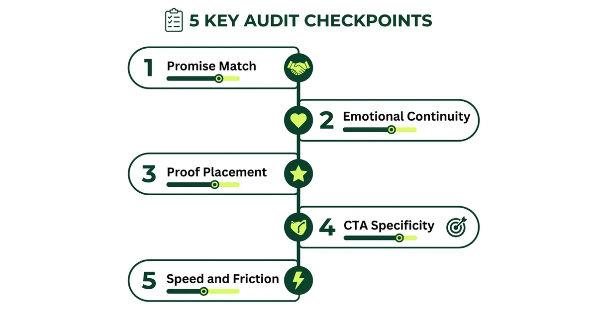
The continuity audit: 5 checkpoints
Run this audit on every active ad and its destination. It takes 15 minutes per ad and can save thousands in wasted spend.
Promise match
Read the core claim in your ad. Now read the headline and first paragraph on the landing page. Are they saying the same thing? Not similar. The same. If your ad says “14 formulations tested over 8 months,” your landing page needs to reference that specific journey, not switch to “clinically proven results.”
Emotional continuity
Identify the emotional trigger in your ad (frustration, aspiration, curiosity, fear of missing out). Does the landing page continue that emotional thread? If the ad leads with frustration (“nothing worked for my skin”), the landing page should acknowledge that frustration before presenting the solution. Do not switch to aspirational language immediately. Meet the visitor where the ad left them.
Proof placement
Where are your reviews, testimonials, and trust signals on the landing page? If they are below the fold, most Meta traffic will never see them. Mobile users from Meta ads scroll fast and decide faster. Place proof elements within the first screen, near the primary CTA. Not at the bottom of the page.
CTA specificity
Read the CTA on your landing page out loud. Does it tell the visitor exactly what happens next? “Shop now” is vague. “Get the starter kit for $29” is specific. “Learn more” is a dead end. “See the 3-step routine” gives the visitor a reason to click. The CTA should be a continuation of the ad’s promise, not a generic action.
Speed and friction
Load your landing page on a phone over a cellular connection. Time it. If it takes more than 3 seconds, you are losing 30 to 50% of your Meta traffic before they see anything. Check the gap between link clicks in Meta Ads Manager and landing page views. If landing page views are less than 70% of link clicks, you have a speed or redirect problem.
Score each checkpoint on a scale of 1 to 5. Any checkpoint scoring below 3 is costing you money right now.
Three mismatch patterns we see constantly
Pattern 1: The specificity drop
The ad: Highly specific. Names the problem, references real numbers, tells a story with texture and detail.
The landing page: Generic brand language. “Premium quality,” “trusted by thousands,” “designed for you.” The specificity that earned attention disappears.
Why it happens: The ad was written by a performance marketer who knows what converts. The landing page was written by a brand marketer who optimized for consistency, not conversion. Neither team reviewed the other’s work.
The fix: Pull the 3 most specific claims from your top-performing ad and make them the headline, subhead, and first proof point on the landing page. Literally copy the language. If “14 formulations over 8 months” is working in the ad, it should be on the landing page.
Pattern 2: The offer mismatch
The ad: Promotes a specific offer, price point, or product bundle. “Starter kit for $29” or “First month free.”
The landing page: Shows the full product catalog, full pricing, or a different offer entirely. The visitor clicked for one thing and landed on another.
Why it happens: The ad team creates offer-specific creative but sends traffic to a general product page because the team does not want to build (or does not have) dedicated landing pages for each offer.
The fix: Build a simple landing page for each distinct offer you advertise. This does not need to be a full redesign. A single page with: the offer headline, 2 to 3 proof points, one CTA button, and a product image. Tools like Unbounce, Shogun, or even a Shopify landing page template can do this in an hour.
Pattern 3: The journey disconnect
The ad: Appeals to a specific audience segment with a specific pain point. “For runners who keep getting shin splints” or “For founders who hate spreadsheets.”
The landing page: Speaks to everyone. No acknowledgment of the specific audience or pain point that the ad targeted. The visitor has to figure out whether this product is for them, even though the ad already told them it was.
Why it happens: The brand has one landing page serving all traffic sources and all audience segments. Someone arriving from a pain-point-specific ad sees the same page as someone arriving from a brand search.
The fix: At minimum, add a dynamic headline that matches the ad’s audience angle. At maximum, build segment-specific landing pages. Even just changing the headline and hero image to match the ad’s audience targeting can lift conversion rates significantly.
“The ad earns attention by being specific. The landing page loses the sale by being generic. The fix is not better creative. It is making the landing page as specific as the ad.
”
Want Us to Audit Your Ad-to-Page Continuity?
We will run the 5-checkpoint audit across your top-spending ads and show you exactly where the handoff is breaking. Free, 30 minutes.
The landing page formula that converts Meta traffic
Meta traffic behaves differently from search traffic. Search visitors already know what they want. Meta visitors were interrupted while doing something else. They gave you a click because your ad earned it, but their intent is fragile. The landing page needs to reinforce that intent immediately.
Here is the structure that works consistently across the D2C accounts we manage:
First screen (above the fold, mobile):
- Headline that mirrors the ad’s core promise (not your brand tagline)
- One line of proof (a specific number, a testimonial snippet, a trust signal)
- Product image or short video
- Primary CTA with specific language
Second screen:
- The problem, stated in the visitor’s language (mirror the ad’s problem framing)
- How your product solves it (mechanism, not features)
- 2 to 3 proof points (reviews, before/after, data)
Third screen:
- Social proof section (reviews, UGC, press mentions)
- FAQ addressing the top 2 to 3 objections
- Secondary CTA
What to remove:
- Navigation bar (for ad landing pages, remove or minimize navigation to reduce exit paths)
- Multiple product options (one offer per landing page)
- Long brand story sections (save these for your About page)
- Any element that does not directly support the purchase decision
This structure works because it mirrors the persuasion arc of the ad itself: hook, problem, proof, mechanism, CTA. The visitor experiences one continuous narrative from ad to purchase, not two disconnected experiences.
How to test continuity without rebuilding your site
You do not need a full redesign to test whether continuity fixes improve your numbers. Here is the minimum viable approach:
Week 1: Audit Run the 5-checkpoint audit on your top 5 ads by spend. Score each one. Identify the weakest checkpoint for each ad.
Week 2: Quick fixes For each ad, make one change to the landing page that addresses the weakest checkpoint:
- If promise match is weak: change the landing page headline to mirror the ad
- If emotional continuity is weak: add a problem-acknowledgment line before the solution
- If proof placement is weak: move your best review above the fold
- If CTA specificity is weak: rewrite the button text to include the offer
- If speed is weak: compress images and remove unnecessary scripts
Week 3 to 4: Measure Compare conversion rate, CPA, and ROAS for the 2 weeks after changes vs the 2 weeks before. The metric to watch is landing page conversion rate (purchases divided by landing page views). If it improves, the continuity fix is working. If it does not, the problem may be deeper (Layer 3: onboarding or offer structure).
The fastest test you can run today
Pick your highest-spend ad. Open it and your landing page side by side. Read the ad headline, then the landing page headline. If they do not say the same thing, change the landing page headline to match the ad. This single change can lift conversion rates by 10 to 30% with zero additional ad spend.
The math: what fixing this is actually worth
Here is why this matters more than most teams realize.
Say you spend $10,000/month on Meta ads. Your current flow:
- 10,000 link clicks at $1 CPC
- 6,500 landing page views (65% load rate, you are losing 35% to speed issues)
- 130 purchases (2% conversion rate on landing page views)
- $77 CPA
Now fix the continuity:
- Same $10,000 spend, same 10,000 clicks
- 8,500 landing page views (85% load rate after speed fix)
- 340 purchases (4% conversion rate after continuity fixes)
- $29 CPA
Same ad spend. Same creative. 2.6x more purchases. CPA drops by 62%.
These numbers are not hypothetical. The range of improvement we see when fixing ad-to-landing page continuity is typically 40 to 120% increase in landing page conversion rate, depending on how broken the original handoff was.
The reason this gets ignored is that it does not feel like a “marketing” problem. It feels like a “website” problem. But in a performance marketing system, the landing page is part of the ad. The experience does not end at the click. It ends at the purchase.
How Gemoniq handles continuity
This is one of the core advantages of running paid ads as a unified system rather than a collection of disconnected tools.
When Gemoniq manages Meta Ads for a D2C brand, the ad creative, the landing page experience, and the post-click flow are all part of the same diagnostic loop:
- Creative and landing page are briefed together. Every ad variant has a corresponding landing page check. The promise in the creative is explicitly matched to the experience after the click.
- The 3-Layer Diagnosis catches mismatches automatically. When Layer 2 metrics drop (strong views but weak clicks or weak post-click conversion), the first thing we check is continuity, not creative.
- Iteration includes both sides. When we update an ad’s hook or CTA, we update the corresponding landing page element in the same cycle. Creative changes and page changes ship together, not weeks apart.
- The diagnostic data tells us which fix to prioritize. Is it a speed problem? A promise mismatch? A proof placement issue? The data from the weekly diagnostic routine tells us exactly where to focus.
The result is that every dollar of ad spend has the highest possible chance of converting, because the entire journey from impression to purchase is managed as one system.
Find Out Where Your Funnel Is Leaking
We will audit your top ads, their landing pages, and the handoff between them. You will know exactly what to fix and in what order. Free, 30 minutes.
Architectural Intelligence
Get the weekly newsletter on design-led performance marketing, directly to your inbox.
No spam. Just intelligence. Unsubscribe anytime.