The Human Ads Playbook: Why 'Ugly' Creative Wins
The feed is full of perfect ads that nobody feels anything about.
AI made ad production fast and cheap. But it also made everything look the same: clean visuals, safe copy, zero texture. Scroll through any Meta or TikTok feed and half the ads are interchangeable. Polished, “correct,” and invisible.
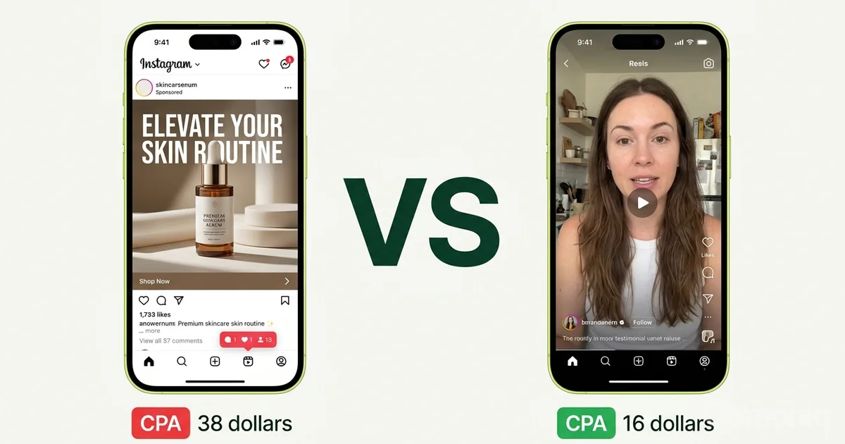
Meanwhile, the ads that are actually converting look like this: a founder talking to the camera with messy hair. A screen recording with a voiceover that sounds like a voice memo. A testimonial filmed on a kitchen counter with bad lighting.
Some people call these “ugly ads.” The better framing is trust-efficient creative: content engineered to lower ad resistance, earn attention in the first two seconds, and feel believable enough to drive action.
This article is a practical guide to producing it, testing it, and scaling it without losing control.
In this article:
- Why polish stopped working — the psychology and distribution mechanics
- The structured persuasion framework — the 6-step architecture behind “raw” ads
- What this looks like in practice — founder-direct, the “mistake” that outperforms, and which metric to watch
- Three things teams get wrong — including when this approach backfires
- The production and testing framework — weekly cycle with test matrix and diagnosis
- How Gemoniq runs this for D2C brands
Why polish stopped working
This isn’t a style trend. There’s a structural reason raw creative is outperforming produced creative, and it operates on three levels.
The anti-ad reflex
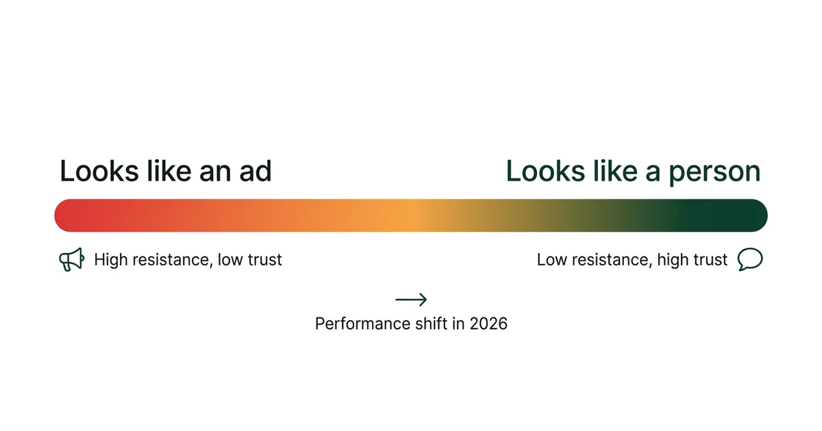
People have built fast, unconscious defenses against obvious advertising. High-production aesthetics — studio lighting, motion graphics, voiceover talent — trigger an immediate internal filter: “I’m being sold to.” That filter goes up in under a second, and once it’s up, nothing in the next 30 seconds matters.
Low-polish creative bypasses that filter because it resembles the content people actually chose to watch: direct-to-camera talking, imperfect framing, conversational rhythm, unscripted-feeling delivery. It reads as person, not brand.
This isn’t speculation. Meta’s own research on Reels ad performance has consistently shown that native-feeling creative outperforms studio creative in attention and hold metrics. The pattern repeats on TikTok and Shorts.
Native camouflage (the distribution advantage)
On algorithm-driven feeds, content that matches the platform’s native communication patterns gets more distribution. The algorithm rewards watch time and engagement, and users watch longer when content doesn’t feel like an interruption.
The Distribution Advantage
Lo-fi production isn’t just a creative choice — it’s a distribution advantage. A founder talking to camera for 30 seconds can outreach a $15K production because the platform’s machinery rewards the format that keeps people watching.
Specificity over polish
The other half of the equation is what’s being said, not just how it looks. Polished ads tend toward generic messaging because they’re expensive to produce and need to work broadly. Raw creative is cheap to make, so you can be specific.
“We tested 14 formulations before we got the texture right” hits harder than “Premium skincare for modern women.” Specificity is the fastest trust signal in a low-attention environment.
The structured persuasion framework
Here’s the mistake most teams make when they hear “ugly creative wins”: they produce genuinely bad creative and call it a strategy.
Human-feeling ads that perform are not random. They look spontaneous but they’re architecturally sound underneath. The best ones follow this structure:
Opinionated Hook
Pattern interrupt in the first 1-2 seconds. Bold claim, controversial take, or emotionally charged question.
Clear Problem Framing
Why this matters right now, to this specific person. Not a general category problem — their exact frustration.
Specific Proof
A real example, a metric, a lived detail — not a generic claim. “412 five-star reviews from women with sensitive skin” beats “thousands of happy customers.”
Simple Mechanism
How the product or approach works differently. One sentence that explains the “why it works” without jargon.
Single Payoff
One clear outcome the viewer cares about. Not five benefits — one result they can picture.
Direct CTA
One action, no ambiguity. “Link in bio. The starter kit is $29.”
The key word is “specific.” Every element that gets more specific gets more persuasive.
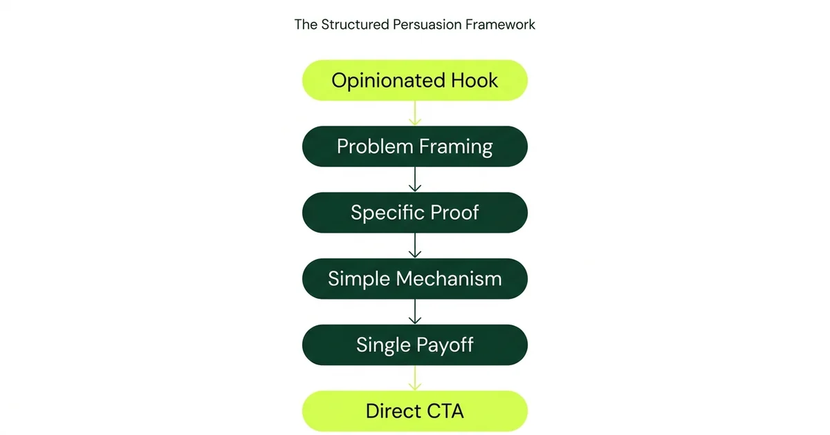
If your team treats this as a repeatable architecture, raw output becomes scalable. You’re not hoping for magic. You’re running a formula with variables you can test.
Framework In Action
[Hook] “I almost didn’t launch this product.” [Problem] “Every moisturizer I tried either broke me out or felt like nothing.” [Proof] “14 formulations. 8 months. My dermatologist thought I was insane.” [Mechanism] “We use [specific ingredient] at [specific concentration] because it actually penetrates.” [Payoff] “My skin hasn’t looked like this since I was 22.” [CTA] “Link in bio. The starter kit is $29.”
That took 20 seconds to film on a phone and zero production budget. But every sentence is doing a job.
What this looks like in practice
Theory is cheap. Here’s what the pattern looks like when brands actually run it.
The founder-as-creative approach
The highest-performing D2C ad format in early 2026 across Meta and TikTok is a founder or team member talking directly to camera, with no script visible, addressing a specific problem their product solves. It works because it combines authority (I made this), specificity (here’s exactly why), and native format (phone camera, natural light, no edits).
Brands that have shifted from studio UGC to founder-direct content consistently report CPA reductions in the 25-40% range within the first two to three weeks of testing. The creative costs less to produce and converts better. That’s the rare double win.
The “mistake” that outperforms
One of the most consistent patterns across Meta and TikTok: slightly imperfect creative generates more active engagement than flawless creative. Content with visible imperfections — a stumble, a correction, an off-center frame — sparks comments, corrections, and participation.
The imperfection creates a gap that viewers fill with reactions. It’s counterintuitive, but “almost right” earns more attention than “exactly right.”
The metric to watch: saves, not likes
Likes are free and reflexive. The engagement signal that actually predicts buying intent is saves (bookmarks on Instagram, saves on TikTok) and shares-to-DM.
When someone saves an ad, they’re telling you: “I want to come back to this.” That’s a purchase-intent signal, not a vanity metric. When someone shares to a friend or team chat, they’re doing your distribution and social proof simultaneously.
Build Your Review Process Around This
- Save rate and share rate are your primary creative KPIs
- A post with 200 likes and 50 saves is worth more than a post with 2,000 likes and 3 saves
- Track save-to-view ratio, not raw save count
Want to See Which Creative Is Actually Converting?
We'll audit your current ad creative across all three performance layers and show you where the biggest wins are hiding.
Three things teams get wrong
1) Ugly is an aesthetic, not an excuse
Lo-fi production values are fine. Lo-fi thinking is not. The camera can be an iPhone, the lighting can be bad, the background can be a kitchen. But the hook still needs to stop the scroll. The proof still needs to be specific. The CTA still needs to be clear.
“Ugly” creative that performs is ugly on the surface and disciplined underneath. Ugly creative that fails is ugly everywhere.
2) You need explicit permission to break polish norms
This is an organizational problem, not a creative one. Many internal teams are constrained by brand guidelines written for a different era: consistent color palettes, approved typography, specific aspect ratios, pre-approved talent.
Those standards were designed for broadcast and print, where consistency built trust over time. On social feeds, those same standards make your content look like advertising — which is now the fastest way to get ignored.
How to Get Internal Buy-In
Founders and marketing leads need to explicitly authorize lower production standards for performance creative. Frame it as a test:
“We’re going to run 10 founder-direct videos alongside our produced assets and measure the difference.”
That’s how you prove the case internally without a brand fight.
3) This doesn’t work for every category
Important caveat. Trust-efficient creative is a tactical lever, not a universal rule.
Brand equity risk: Premium and luxury categories can erode perceived value if they over-index on lo-fi aesthetics. A raw iPhone video might work for a $30 skincare brand but damage positioning for a $300 fragrance.
The authenticity uncanny valley: Large corporates attempting creator-style language often sound forced. If the voice doesn’t match the brand’s actual personality, the audience detects the mismatch instantly and the backlash is worse than running a traditional ad.
Format fatigue: As more brands adopt lo-fi creative, the format itself will lose its “native camouflage” advantage. The brands that win long-term will be the ones that combine the trust mechanics of human creative with genuinely original messaging — not just the aesthetic.
Use this as a performance lever, not a religion. Test it. Measure it. Scale what works for your specific audience.
The production and testing framework
Here’s the weekly cycle for running this at scale without chaos:
Step 1: Pattern research (1 hour)
Pull the top 5 native creators in your product category. Not influencers with millions of followers. People with 10K-100K followers who get high save rates and comment-to-view ratios. For each one, document:
- How they open (hook structure)
- How they prove their point (testimonial, demo, data, story)
- What their CTA sounds like (direct, soft, embedded)
You’re extracting patterns, not copying content.
Step 2: Variant production (2-3 hours)
Produce 5 rough variants. Not 1 polished master.
Use this lightweight test matrix:
| Variable | Variants | Purpose |
|---|---|---|
| Hook | 3 variants | Pain vs. aspiration vs. curiosity entry points |
| Proof style | 2 variants | Testimonial vs. demonstration |
| CTA | 2 variants | Soft “check it out” vs. direct “buy now, $X” |
That’s 12 possible combinations. Pick the 5 that feel most distinct from each other.
Film on a phone. Natural light. No editing beyond basic cuts. Each variant should take 10-15 minutes to produce, not hours.
Step 3: Publish and measure (3-4 days)
Run the variants as paid creative on Meta. Use your standard campaign structure. Don’t change targeting, budget, or bid strategy. You’re isolating creative performance, nothing else.
Track four metrics per variant:
- Hold rate — are they watching past 3 seconds?
- CTR — are they clicking?
- Save rate — are they bookmarking?
- Post-click conversion — are they buying?
Step 4: Diagnose and scale (1 day)
After 3-4 days of data, categorize each variant:
| Hold Rate | CTR | Diagnosis | Action |
|---|---|---|---|
| High | High | It’s working | Scale this |
| High | Low | Hook works, CTA doesn’t | Rewrite the CTA, keep the hook |
| Low | Any | Hook failed | Test a new hook |
| Any | High but low conversion | Creative works, landing doesn’t | Fix post-click flow |
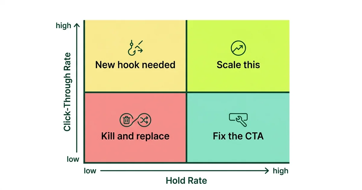
Scale the winning patterns into your next batch. Kill what didn’t work. Repeat weekly.
For the full post-click diagnosis framework, see The AI Growth Loop. And for AI tools to create ad visuals without a designer, read Ad Creatives Without a Designer.
“In 2026, the best ad is not the prettiest one. It’s the one that feels like a person said it and meant it.
”
Polish is baseline now. Every brand has access to the same AI production tools. The differentiator is believability: can you make someone feel, in the first two seconds, that this is worth their attention?
If your current creatives are “perfect” but underperforming, don’t start with better lighting. Start with better human signal. A founder on camera, a specific claim, a real number, an imperfect frame. That’s where the performance is.
How Gemoniq runs this for D2C brands
This creative approach works best when it’s connected to a system, not run as isolated experiments.
Gemoniq operates Meta Ads end to end for D2C brands, which means the creative strategy described in this article feeds directly into campaign execution, performance measurement, and iteration:
Creative Direction
Informed by what’s actually performing — not brand committee preferences.
Variant Production
Built into the campaign cadence, not treated as a separate workstream.
Performance Diagnosis
Separates creative problems from post-click problems so you fix the right thing.
Iteration Loops
This week’s learnings become next week’s creative brief. Every cycle compounds.
Your ad account stops being a guessing game and starts being a system that improves every cycle.
Get Your Creative Audit
We'll map the highest-leverage creative improvements for your brand and show you where 'ugly' creative can cut your CPA.
Architectural Intelligence
Get the weekly newsletter on design-led performance marketing, directly to your inbox.
No spam. Just intelligence. Unsubscribe anytime.